I have updated the class TRestAnalysisPlot to make a better hierarchy of plot contents. As we agreed in
we are going to add a new definition “histo” under “plot” section, which draws multiple histogram onto a same pad, helping to compare observables from different files or under different cuts.
Therefore, we have a new base unit of the plot: histo. In the new design scheme of TRestAnalysisPlot, this class contains a vector of “plot” object. Each of them in turn contains a vector of “histo” object. TRestAnalysisPlot handles a TCanvas object. Then, the contained “plot” handles TPad objects inside TCanvas. Finally, the contained “histo” handles TH1/TH2 objects inside TPad.
I kept the old TRestAnalysisPlot rml definition and introduced new definition of multi-histo plot, for multi-cut plot, one can write like following.
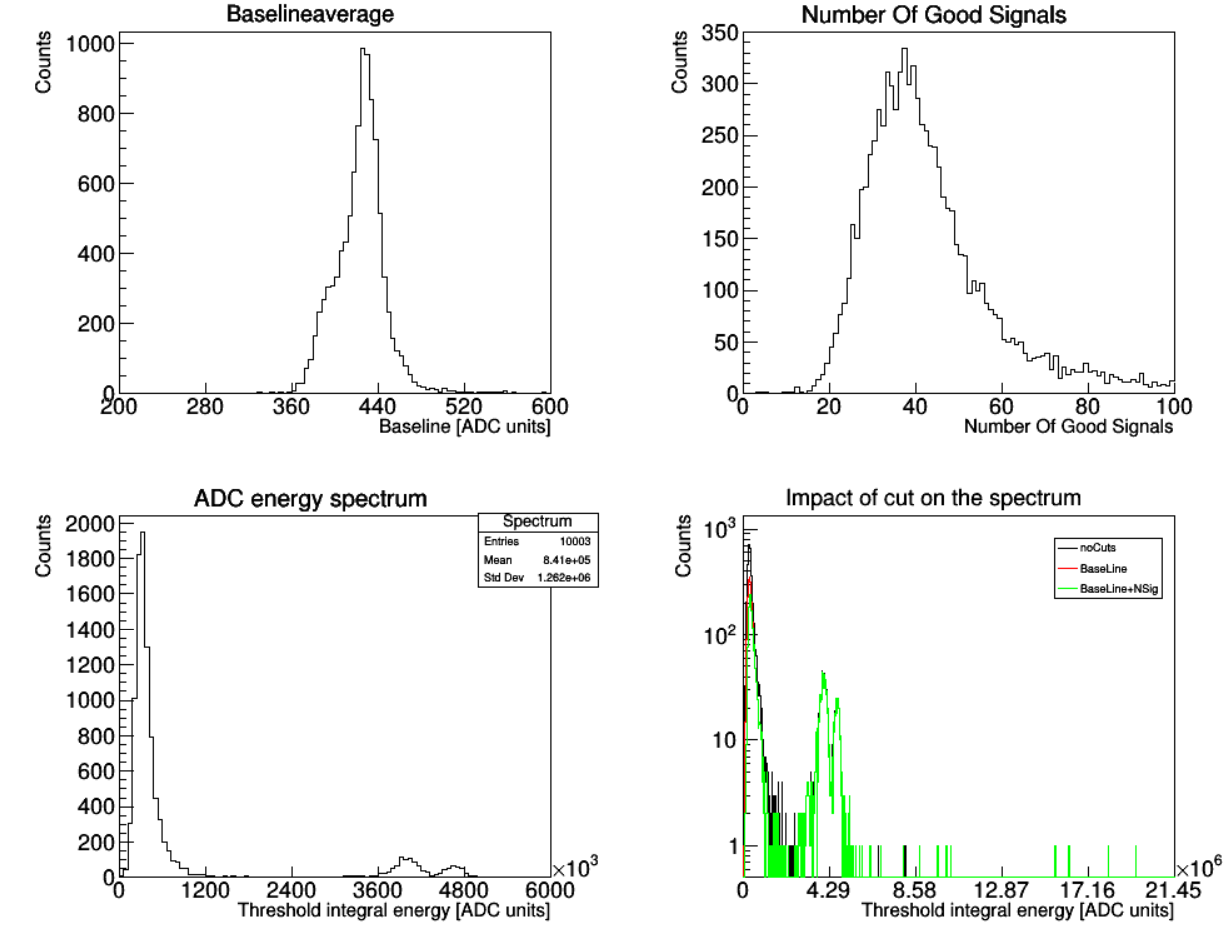
<plot name="Spectrum_CutImpact" title="Impact of cut on the spectrum"
xlabel="Threshold integral energy [ADC units]" ylabel="Counts" logscale="true"
legend="on">
<histo name="noCuts">
<variable name="sAna_ThresholdIntegral" nbins="1000" />
<parameter name="lineColor" value="1"/>
</histo>
<histo name="BaseLine">
<variable name="sAna_ThresholdIntegral" nbins="1000" />
<cut variable="sAna_BaseLineSigmaMean" condition="<12" value="ON" />
<parameter name="lineColor" value="2"/>
</histo>
<histo name="BaseLine+NSig">
<variable name="sAna_ThresholdIntegral" nbins="1000" />
<cut variable="sAna_BaseLineSigmaMean" condition="<12" value="ON" />
<cut variable="sAna_NumberOfGoodSignals" condition=">35" value="ON" />
<parameter name="lineColor" value="3"/>
</histo>
</plot>
For different observable comparision, one can do:
<plot name="plotName" title="" xlabel="Z [mm]" ... >
     <histo name="R12">
         <variable name="tckBlob_2D_Qlow_X_R12" .... >
     </histo>

     <histo name="R15">
         <variable name="tckBlob_2D_Qlow_X_R15" .... >
     </histo>

     <histo name="R18">
         <variable name="tckBlob_2D_Qlow_X_R18" .... >
     </histo>
 </plot>
For different file plot:
    <plot name="ABC" title="" xlabel="Track energy ratio" legend="on" logy="on">
      <histo name="0vbb" fillColor="xxx" lineColor="xxx">
        <variable name="TrackEnergyRatio"/>
        <classify fRunTag="NLDBD"/>
      </histo>

      <histo name="micromegas Th232" fillColor="xxx" lineColor="xxx">
        <variable name="TrackEnergyRatio"/>
        <classify fRunTag="Th232"/>
      </histo>

      <histo name="micromegas U238" fillColor="xxx" lineColor="xxx">
        <variable name="TrackEnergyRatio"/>
        <classify fRunTag="U238"/>
      </histo>
    </plot>
For single histo plot, the variables can still be added directly inside “plot section”:
    <plot name="Baseline average" xlabel="Baseline [ADC units]" ylabel="Counts"
            logscale="false" value="ON" >
      <variable name="sAna_BaseLineMean" range="(200,600)" nbins="100" />
    </plot>
The change is:
- Line color/width, fill color, etc. options are now defined in histo level.
- “Classify” keyword now needs to be defined explicitly in histo level.